Key takeaways
- Mobile-friendly websites adjust to different screen sizes.
- Responsive design helps customers navigate without zooming or horizontal scrolling.
- Google primarily uses mobile content for indexing.
- Clear contact buttons and forms make inquiries easier.
- Fast loading and visual stability contribute to better usability.
- Existing websites can often be improved without a complete rebuild.
- MCC Softwares provides responsive web application development.
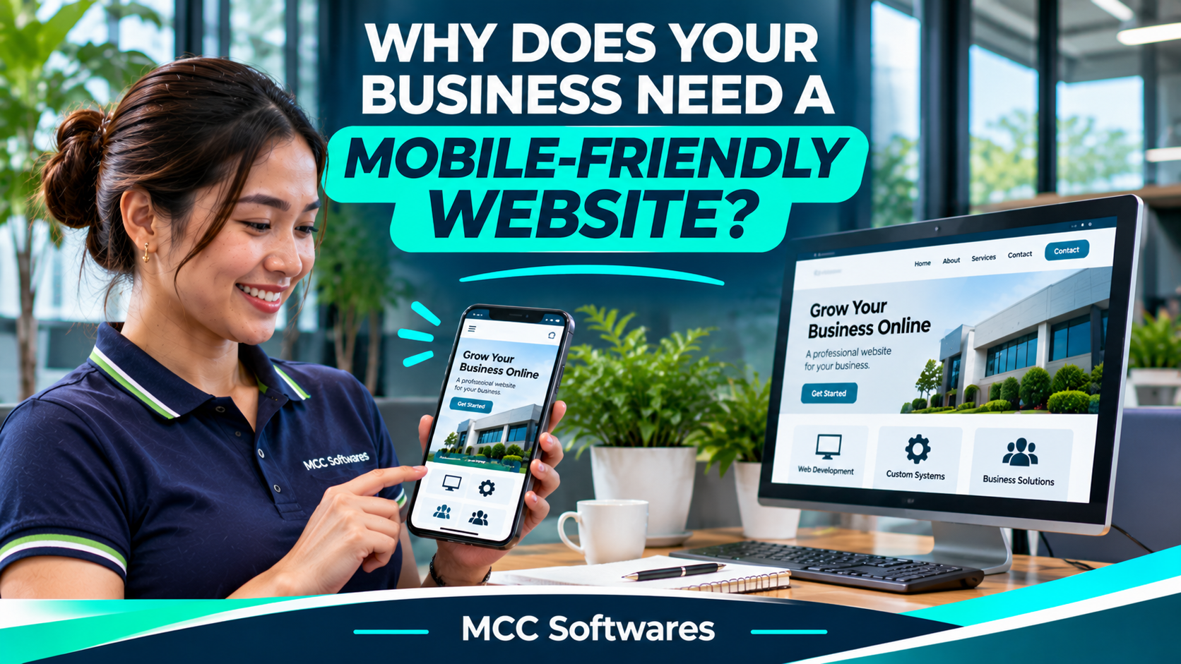
Imagine someone finding your business on Google while using their phone. They open your website, but the text is too small, the images don't fit, and the contact button is difficult to tap.
What do you think they'll do?
They might leave and check another business instead.
A mobile-friendly website makes it easier for customers to browse your services, read important information, and contact your business using a smartphone.
For businesses in the Philippines, whether you're operating in Cotabato City, Davao City, or elsewhere, mobile usability should be part of your website planning from the beginning.
What Is a Mobile-Friendly Website?
A mobile-friendly website is designed to work properly on smartphones and other smaller screens.
Instead of forcing visitors to zoom in or scroll sideways, the layout adjusts to the available screen space.
For example, a desktop website might display three service cards in one row. On a smartphone, those cards can appear vertically so customers can read them comfortably.
This approach is commonly called responsive web design.
According to Google Search Central, responsive design is Google's recommended approach because it allows the same website content to adapt to different devices.
1. Customers Can Browse Your Website More Easily
Think about how people use their phones.
Someone might be looking for a nearby clinic, comparing restaurant menus, or checking the services of a construction company.
They want information quickly.
If your website is difficult to navigate, even simple tasks can become frustrating.
What Makes a Website Easy to Use on Mobile?
A good mobile layout should have:
Readable text without zooming
Buttons large enough to tap comfortably
Menus that work on smaller screens
Images that fit without breaking the layout
Forms that are easy to complete
Clear contact information
These details may seem small, but together they make the browsing experience much more convenient.
2. Mobile-Friendly Design Matters for Google Search
Having a business website is useful, but customers also need to be able to find it.
Google uses mobile-first indexing, meaning it primarily uses the mobile version of a website's content when indexing pages.
If important information is missing from your mobile layout, Google may not understand your page as completely as it could.
This doesn't mean a mobile-friendly website automatically ranks first.
Search rankings also depend on content relevance, competition, website quality, and other factors.
However, Google's mobile-first indexing recommendations make it clear that providing complete, accessible mobile content is important.
3. It Makes Customer Inquiries More Convenient
Let's say someone finds your business online and wants to ask about your services.
If they're browsing on a smartphone, they probably don't want to copy your phone number manually or navigate through several pages just to find a contact form.
A mobile-friendly website can provide convenient ways to reach you.
For example:
Call Now: Opens the phone's calling interface.
Send an Inquiry: Directs visitors to a simple contact form.
Get Directions: Opens your business location in a mapping application.
View Services: Helps customers find the information they need.
These features don't guarantee more inquiries, but they can remove unnecessary steps between visiting your website and contacting your business.
4. Website Loading Speed Also Matters
Mobile-friendly design isn't only about appearance.
A website should also load efficiently.
Large images, unnecessary scripts, and poorly optimized pages can make a site feel slow, particularly on weaker mobile connections.
Imagine opening a restaurant website just to check the menu, but waiting several seconds for oversized images to load.
You might decide to look somewhere else.
Google's Core Web Vitals guidance recommends monitoring loading performance, responsiveness, and visual stability.
Some practical improvements include compressing images, reducing unnecessary scripts, and using appropriate website hosting.
5. Your Website Should Work on Different Devices
Not every customer uses the same smartphone.
Some browse using Android devices, others use iPhones, and some switch between tablets and computers.
A responsive website should adapt to different screen sizes without requiring a completely separate website for each device.
For businesses offering online booking or customer forms, testing is especially important.
An appointment form that works perfectly on a computer may still have problems on a phone.
Always test important features on mobile devices before launching.
6. It Helps Your Business Present Information Clearly
A website can look professional on a large monitor but become confusing on a small screen.
For example, your homepage might contain a detailed company introduction, several photographs, service descriptions, and multiple buttons.
On mobile, these elements need to appear in a sensible order.
Prioritize What Customers Need
For a local business, visitors may want to see your services, opening hours, location, and contact details first.
For an online store, product information, prices, and checkout should be easy to access.
Good mobile design isn't about removing useful content. It's about organizing it so people can find what matters.
How Can You Check if Your Website Is Mobile-Friendly?
You don't need to be a developer to identify basic mobile usability problems.
Open your website using your phone and try completing common customer tasks.
Can you find your services? Is the contact button visible? Can you fill out a form without struggling? Does the page fit your screen?
For a more technical assessment, use Google PageSpeed Insights to review mobile performance and improvement opportunities.
You can also check the Core Web Vitals report in Google Search Console.
If your website has problems, identify the most important fixes before considering a complete redesign.
Mobile-Friendly Web Development by MCC Softwares
At MCC Softwares, we develop responsive web applications and digital solutions for businesses and organizations in the Philippines.
Based in Cotabato City, MCC Softwares works on systems that can be accessed through supported desktop, tablet, and mobile browsers.
Our web application development services focus on responsive interfaces, practical workflows, and usability across devices.
Whether you're planning a new website or improving an existing digital platform, it's worth reviewing how customers will actually use it.
For businesses that need custom features such as online forms, bookings, or customer portals, these requirements can be included during project planning.
Contact MCC Softwares to discuss your website or web application requirements.
Frequently Asked Questions
Does a mobile-friendly website help with SEO?
It supports mobile usability and helps ensure Google can access the mobile version of your content. However, mobile-friendly design alone doesn't guarantee higher rankings.
Do I need a separate mobile website?
Usually not. Responsive web design allows one website to adjust to different screen sizes.
Can an existing website be made mobile-friendly?
Often, yes. Depending on the current design and technology, a developer may be able to improve its layout without completely rebuilding the website.
Final Thoughts
A mobile-friendly website isn't just about making your business look modern.
It's about making information easier to read, helping customers navigate your pages, and allowing people to contact you without unnecessary difficulty.
Before investing in additional website features, make sure the basics work properly on a phone.
Your website should be just as useful in someone's hand as it is on their computer.
Questions this article answers
- Why does a business need a mobile-friendly website?
- What is responsive web design?
- Does mobile-friendly design help SEO?
- How does Google's mobile-first indexing work?
- How can businesses improve mobile website performance?
- Does a business need a separate mobile website?
- How can you test whether a website works well on phones?
Sources and references
- Mobile-First Indexing Best Practices — Google Search Central
- Understanding Core Web Vitals — Google Search Central
- Understanding Page Experience — Google Search Central
- PageSpeed Insights — Google
- Web Application Development Philippines — MCC Softwares
Topics covered
MCC SoftwaresGoogle SearchGoogle Search CentralGoogle Search ConsolePageSpeed InsightsMobile-First IndexingResponsive Web DesignCore Web VitalsWebsite DevelopmentPhilippinesCotabato City
Related MCC products and services
Last reviewed for accuracy: 17 November 2026.
Related articles
-
Website Development in Davao: A Business Owner’s Planning Guide
Planning a business website in Davao? Learn how to define your goals, compare proposals, budget for ongoing costs, and prepare for launch with clear ownership and support arrangements.
-
Custom Web Application Development for Small Businesses
Is custom web application development worth it for your small business? Compare ready-made software, total costs, potential benefits, and the questions to ask before hiring a developer.
-
How to Choose a Website Developer in the Philippines
Choosing a website developer? Learn how to compare portfolios, proposals, costs, ownership, SEO, and ongoing support before hiring a developer for your Philippine business.
-
Affordable Custom Software Development in Cotabato City
Planning a custom system in Cotabato City? Learn how to compare proposals, prioritize features, budget for support, and explore MCC Softwares solutions for your organization.